

Our list of the best ‘Pro Sports Branding’ went so well, it was only right that the minor league teams that call Washington home get a list of their own. This list will be made up of the smaller town teams that are fan favorites. In order to make this list, you cannot be in the top tier of your respective sport. This means professional teams are allowed as long as they don’t play in the highest league possible in their sport. Also, you need to be a current and active franchise, any teams that no longer play will not be considered. The current primary logo will be the one in competition today, no throwbacks and no promotional names.
Where as our other list graded on a specific list of criteria, so will this one. However, minor league sports have a bit of a different marketing strategy compared to their big league counterparts. Fun and sometimes silly names are more appropriate for the minors and therefore will be looked on favorably on this list. Names that mean something to the area or city the teams play in will still receive bonus points. Use of colors, logo quality and originality will also be determining factors in this list. So here we go again, our rankings of the best minor league branding in the state.
9. Tri-City Dust Devils (MiLB/NWL)
 The Name:
A dust devil is a strong, well-formed, and relatively short-lived whirlwind. These are very common in dry and flat areas of this country – which if you have traveled to the Tri-Cities before, you’d know that’s a great representation of the terrain. The word ‘devil’ makes it a bit better and gives some creativity to the logo, but at the end of the day, the mascot is a dirt spiral. It was said that bonus points would be given to fun and quarky team names, but this isn’t all that fun. It does represent the area pretty well, so there’s that I suppose. It just barely isn’t the worst name on this list.
The Logo:
Clip Art comes to mind on this one. It features a ‘dust devil’ but with a face and little horns to really emphasize that devil aspect. The colors are actually pretty good as blue and gold are one of the better combinations. The teams name runs on top of the whirlwind and is much needed to figure out exactly what we are looking at here. This one comes in at the bottom of the logo designs.
The Verdict:
Not great. They twirl their way into our bottom spot at #9.


8. Tri-City Americans (WHL)
 The Name:
Yes, the team plays in the United States. No, that’s not the only reason for the team name. The name Americans was used due to the regions involvement in the Manhattan Project, which was the project that helped develop the atomic bomb during the 1940’s. The creation of the Hanford Site and development of the bomb were some of the biggest reasons for the population boom in the area. So if you look at in the sense that the area helped end a World War, then yes the people there were true Americans. But a more explosive nickname would have been better. Having to explain all of this backstory means the name really misses the mark.
The Logo:
The logo screams patriotism. It was designed in an army badge style and has the obvious red, white and blue color scheme to accompany it. It delivers the message of what the team name is, but doesn’t do much else. Pretty boring logo.
The Verdict:
Someone needs to head down to the Tri-Cities and help that region with it’s sports branding. The Americans is a boring name for a region that has a lot of history. So many more names could have been used to help give a better representation to the people. But, I’m also well aware how much pride people take in their country. To each their own, Americans land at #8.
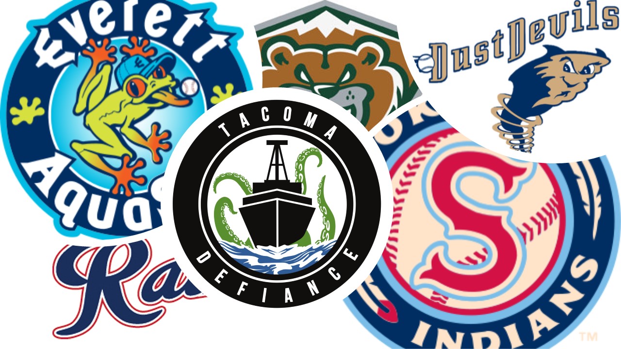
7. Tacoma Rainiers (MiLB/PCL)
![]()
The Name:
The only true points this team gets is with it’s name. The name originated back in 1938 when there was the minor league club known as the Seattle Rainiers. The name came from the Rainier Brewing Company who bought the team in the late 30’s. They got their name from the famous Mt. Rainier which towers over the region. The name is nice due to history, but doesn’t do much after that.
The Logo:
Boring. The logo features the Rainier ‘R’ with the rest of the team name spelled out next to it. For a team that is no longer owned by the brewing company, they sure do love to give them free advertisement. Red, white and blue which is somehow a theme on this list, doesn’t distinguish them from anyone.
The Verdict:
A mid-2000’s rebrand of this team made them beyond boring. Dropping their major clubs colors and getting rid of the Mt. Rainier logo led to bland. This one was not hit out of the park, but maybe a single? Rainiers come in at #7.
6. Spokane Chiefs (WHL)
![]()
The Name:
The Spokane area, much like the rest of the state, has a long history when it comes to Native American culture. The name brings homage to that culture while still elevating with a high ranking such as ‘chief’. Strong name for the region and to represent the team.
The Logo:
Not a lot going on in this logo, but that’s a good thing. A ‘S’ for Spokane is front and center with the red, white and blue color scheme. If you have a keen eye, you will also notice the ‘C’ for Chiefs also present. What adds to the logo is the feathers that come of the back end of the logo. The feathers, often associated with Native head dresses, let you know the team identity and shows it off proudly. In the age where many team mascots are coming under fire for their portrayal of Natives, this teams branding does it correctly.
The Verdict:
The teams identity is very major for a minor league club. That shouldn’t hurt their ranking, but other clubs above them just do a little bit more. Check them out at #6.
5. Spokane Indians (MiLB/NWL)
 The Name:
A city that brands together, stays together. Both Spokane teams go down the same rout when it comes to naming. The baseball team goes with just the straight out name ‘Indians’, which isn’t quite as good as ‘Chiefs”. Spokane does do a lot better job of bringing honor to the name compared to Cleveland, whom they have never been affiliated with.
The Logo:
This is what places them above their city mates. We see the colors of the flag again in this logo, but with a different tint. That’s because they are based off the colors of the Redband Trout, a fish indigenous to the area. A circular logo is common in baseball, but this team does it so well. The S with a baseball are in the middle, then surrounded by the team name. Again, we see the native feathers as they divide the city and name. They have an alternate logo with the name being in Salish, which is the language of the Spokane tribe. If that was their primary logo, they might have jumped up one more spot.
The Verdict:
Solid and prideful. The branding is done very well with this ball club. All of their alternate logos are also done very well and shows how much this team owes to their marketing department. The Indians slide in at #5.
4. Tacoma Defiance (USL)
![]()
The Name:
Double meaning alert. The team name is based on Point Defiance, a park located in Tacoma that isn’t too far away from where they play. The name Defiance also shows the resilience of the club. Double meaning names must be a local soccer team thing, as the Reign also have that going with their branding.
The logo:
Keeps the colors of their parent club, the Seattle Sounders. They just add a little more black. The logo features a ship based off of the USS Point Defiance sailing the waters as the tentacles of a giant pacific octopus come from the depths. The octopus is based off of the giant creature that calls the waters under the Tacoma Narrows home. The ship is a naval vessel that was decommissioned back in 1984, but was based in the area. So many local details crammed into one logo, you gotta love it.
The Verdict:
It was hard to not have this one higher on the list. It’s even crazier when you think about the fact that this team used to be called S2. The Defiance are kicking it at #4.
3. Everett Aquasox (MiLB/NWL)
 The Name:
Almost done with this list and yet this is only our second fun and goofy team name. Unlike the Dust Devils, this name is awesome. An aqua sock is something many people wear when doing activities near or in the water to protect their feet. People in the northwest do love to do water things so that’s good. The name ‘sox’ is also commonly used in the baseball world. White, Red or the infamous Black Sox. Everett does it with a little minor league fun.
The Logo:
Here we go with circles again. This one has a frog in the middle which acts as the main mascot for the club. According to long-time team radio broadcaster Pat Dillon, “The frog is a cross between a Pacific tree frog and a Central American red-eyed tree frog—and Brooks Robinson.” Another cool part about this logo is how they show their affiliation with the Mariners. The E in Everett, is actually the Mariners old trident logo turned to the side to replicate the letter. This logo is also used on their road caps. The colors; navy, aqua, light green, orange, white are both familiar but unique to this area. It’s goofy, fun and everything that minor league baseball is.
The Verdict:
Where other teams seem to go the serious rout on this list, the Aquasox successfully went in the other direction. Minor league sports are usually more about the fans and family fun, this ball club gets that. They are the grand-salami of the baseball teams on this list, number 3 for them.
2. Everett Silvertips (WHL)
 The Name:
Silvertips is a nickname given to the grizzly bears that roam the mountain ranges of the Pacific Northwest. It’s a unique name and avoids doing the cliche names like Grizzlies, Kodiaks or just Bears. In fact, they are the only team that pops up when you google ‘Silvertips’ so that’s pretty good branding. Something about Everett and having names that they can only claim.
The Logo:
Would you want to be caught in the woods staring down the bear in this logo? Didn’t think so. You get your typical brown bear in the logo, but it’s outlined in green and white to make it pop. The best part of the logo is the bears back, which is a depiction of a snow capped mountain. Subtle things like that always get bonus points around here.
The Verdict:
You can try and find a negative with this branding, but you won’t be able to. Name is unique, logo is fearsome and the colors are perfect. The Silvertips skate in at our #2 spot.
1. Seattle Thunderbirds (WHL)
![]()
The Name:
The thunderbird is a legendary creature in certain North American indigenous peoples’ history and culture. It is considered a supernatural being of power and strength. So it’s connection to the region is apparent. The name is loved so much within the local hockey community, that many wanted it to be used as the name of the new NHL franchise. They went in a different direction, which means the WHL squad got to keep the best name in the state. It also perfectly celebrates native culture while not being in that touchy area of disrespecting those same people. It’s just a great name.
The Logo:
The name was great, the logo is better. It features the mythical creature in a wood carving/totem style. The birds wings are spread and across it’s chest reads Seattle. Much like their rivals, the Silvertips, the Thunderbirds also have a hidden image in their logo. Two hockey sticks encase the city name to subtly show the sport this team plays. All of this is made even better by the use of blue, green and silver. Colors that have deep roots in the Puget Sound.
The Verdict:
It was an easy decision at the top spot. The Thunderbirds went above and beyond in their branding. Not to say other teams didn’t do great with theirs, but they just did it better. Several different teams, mostly at the college level, also use the name but it is still very Northwest. The logo is beautiful and every detail was done with precision. You can’t beat it, the Seattle Thunderbirds are our champion of the minor league branding.
Final Thoughts:
Again, the region shows their excellent branding capability when it comes to sports. Each team on this list picked a name that had some sort of history with the city they played in. Some even payed homage to long defunct teams of the past. You can never please everyone, but these teams did their best and trying to accomplish that feat.
This list, although using a grading scale, is mostly opinion. Everyone has their own idea of whats best and worst, that’s the fun part of these types of lists. Hopefully you’ve enjoyed our ranking of the best minor league branding in the state.
www.elisportsnetwork.com